Beyond Aesthetics: Is Your Website Actually Working? (A Jargon-Free Checklist)
If you know me at all, you will know that I absolutely love fashion, interiors, and all things pretty. I have a deep appreciation for beautiful aesthetics and the creative minds behind them.
But great design is never just about looking good. It provides a functional solution.
Your website is the same. At the end of the day, it actually has a job to do.
The aesthetic trap vs. the analytical reality
When planning a new website or a rebrand, it is remarkably easy to get swept up in the visuals. We naturally gravitate toward things we personally like, such as trendy layouts or our favourite colours.
Whether a site is being built from scratch or a strict visual brief is being handed over to a developer, it can be tempting to prioritise those aesthetics over the logic of what actually works.
I have faced this exact struggle with one of my own brands, VIP Days (vipdays.com.au). If it were entirely up to my personal aesthetic preferences, all my branding work would be pink… and then more pink! Hahaha.
But VIP Days is a platform representing high-speed execution for service providers who offer VIP intensives.
Because the platform represents speed and momentum, the brand palette uses orange and purple, which are high-energy, ‘fast’ colours. It makes logical sense for the business and the audience it serves, even if it isn’t my personal aesthetic preference.
We always have to step back and ask: Is this what the business truly needs? Is it really working?
The power of technical logic
When it comes to building digital solutions that generate real commercial results, my superpower isn’t visual design. While my skills are rooted in decades of hands-on technical experience on the keys, my actual superpower is analysis and logic.
I see how things work at a structural level. More importantly, I see the technical problems and hidden system leaks that nobody else is spotting, whether they exist now or are waiting to rear their head in six months.
I look past the pretty exterior to see the foundation underneath. A website can look absolutely fabulous, but if the underlying logic is broken, your visitors will leave in frustration, your conversions will be poor, and your search rankings will tank.
I have condensed this reality check into 25 simple, jargon-free points.
Grab a coffee (seriously, it’s a big list!), grab a blank notebook to sketch out ideas, and let’s see how your site actually stacks up.
1. Accessibility & Performance – Your Site Foundations
This is all about making sure your site is fast, functional, and easy for everyone (including search engines and AI models) to read and understand.
- [ ] Site load time is reasonable: If your home page takes more than a few seconds to load, visitors are already gone.
- [ ] Adequate text-to-background contrast: Can people actually read your text without squinting? This is non-negotiable for accessibility and usability.
- [ ] Font size and spacing are easy to read: Give your words room to breathe on the page. Use clear headings, short paragraphs, and clean bullet lists.
- [ ] Heavy add-ons are used sparingly: Keep your site architecture light and fast. Avoid outdated animations, heavy scripts, or bulky, unnecessary plugins.
- [ ] Images have appropriate Alt tags: This is crucial for accessibility screen readers and forms the foundation of Technical SEO and AI search readability (AEO).
- [ ] Site has a custom 404/Not Found page: If someone clicks a broken link, give them a polite, helpful way back to your main content rather than a dead end.
2. Identity & First Impressions – The 5-Second Test
You have about five seconds to tell an intelligent visitor who you are and why they should care before they bounce.
- [ ] The company logo is prominently placed: Usually the top left or centre, linked directly back to your home page.
- [ ] Tagline makes your purpose clear: Don’t make visitors guess what you do. Have a clear, bold hero headline above the fold.
- [ ] Home page is digestible in 5 seconds: The core logic of what you offer should be instantly obvious to a cold scroller.
- [ ] Clear path to company information: An easy-to-find ‘About’ page that establishes who is behind the brand.
- [ ] Clear path to contact information: Never hide how people can hire you or ask a technical question. Have a clear ‘Contact’ button in your main menu.
3. Navigation & User Flow – The Map
A confused mind says no. Your navigation should be a logical map, not a scavenger hunt.
- [ ] Main navigation is easily identifiable: It should sit exactly where people expect it to be (header and footer).
- [ ] Navigation labels are clear and concise: Use plain language (e.g., ‘Services’), not clever riddles (e.g., ‘Potent Positioning Potions’).
- [ ] Number of buttons/links is reasonable: Too many menu choices lead to decision fatigue. Keep it tight.
- [ ] Links are consistent and easy to identify: If it is a link, it should look like a link (e.g., a contrasting accent colour or a clear hover state).
- [ ] Site search is easy to access: Let people find exactly what they want immediately without digging through archives.
4. Content & Layout – The Delivery
Tidy data and clean architecture make for a seamless user experience that converts.
- [ ] Major headings are clear and descriptive: People scan before they read. Your headings must tell a logical story on their own.
- [ ] Critical content is above the ‘fold’: Put your most important message, unique value proposition, and primary call to action where visitors can see them before they start scrolling.
- [ ] Styles and colours are consistent: Establish a clean visual pattern and stick to it across every single page.
- [ ] Emphasis (bold, italics) is used sparingly: If everything is bold, nothing is bold. Use formatting strategically.
- [ ] Ads and pop-ups are unobtrusive: Don’t interrupt the user’s workflow aggressively or block critical navigation menu buttons.
- [ ] Main copy is concise and explanatory: Get to the point quickly without drowning the reader in fluffy corporate filler.
- [ ] URLs are meaningful and user-friendly: Use clean directory paths (e.g.,
/services/fractional-tech-partner/instead of/page-id-489/). - [ ] HTML page titles are explanatory: This tells Google, AI models, and your visitors exactly what the page is about.
- [ ] Main blog page can be digested easily: When reviewing your blog feed, ensure posts are listed clearly with readable titles, clean category tags, and crisp thumbnails.
Putting your tech on easy mode
If you went through this list and realised your website is relying a bit too much on its looks and not enough on its technical logic, don’t panic.
Translating these complex tech problems into tidy, robust solutions is exactly what I do.
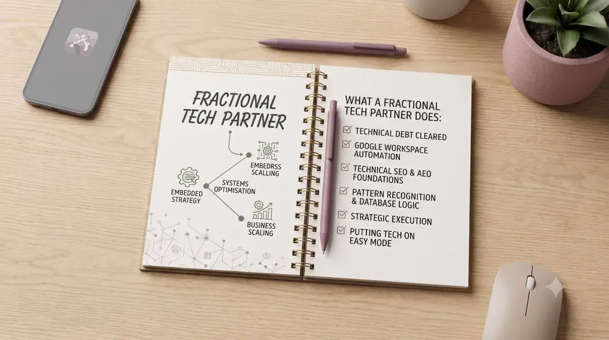
Whether you need a trusted Fractional Tech Partner on a 6-month retainer to oversee your entire architecture, or a dedicated VIP Intensive to rapidly rebuild your foundations, I can help.
Ready to untangle your tech? Visit lara.net.au to see how we can work together, or book a Clarity Call to get your systems talking.